
JavaScript visualization libraries vary significantly, yet teams often select the wrong one from the outset.
A common issue is that reviews tend to group lightweight charting tools, highly customizable frameworks, and enterprise platforms together, despite their very different strengths. Picking the wrong type — like using a complex system for simple dashboards or a basic one for demanding analytics — can lead to unnecessary complexity and costly rebuilds.
To avoid that issue, we rated the top 11 libraries on performance, customization, developer experience, scalability, and real-world fit. This guide showcases the libraries that offer the greatest value for modern applications.
Here’s how the top 11 compare:
| Library | Best For | Rendering Engine | Chart Types | Framework Support | Licensing |
| SciChart | Million-point datasets, real-time | GPU-accelerated | 2D/3D/Maps/Gauges | JS/React/Native | Commercial |
| D3 | Pixel-perfect custom visualizations | SVG/Canvas/DOM | Unlimited (primitives) | Framework-agnostic | Open-source |
| Highcharts | Accessible enterprise dashboards | SVG | 60+ (modular) | React/Angular/Vue | Commercial |
| amCharts | Comprehensive chart coverage | Canvas/SVG | 60+ | Framework-agnostic | Commercial |
| ZingChart | Real-time drill-down dashboards | Canvas | 50+ | Framework-agnostic | Commercial |
| Fusioncharts | Multi-framework consistency | SVG | 95+ | React/Angular/Vue | Commercial |
| Plotly | Data science analytics apps | WebGL/SVG | 40+ | Python/R/JS | Open + Commercial |
| ApexCharts | Rapid SaaS dashboard prototypes | SVG | 20+ | React/Angular/Vue/ Blazor | Open-source |
| Apache ECharts | Progressive rendering at scale | Canvas/SVG | 20+ | Framework-agnostic | Open-source |
| CanvasJS | Financial charts, large datasets | Canvas | 30+ | Framework-agnostic | Commercial |
| Chart.js | Lightweight web dashboards | Canvas | 8 core types | Framework-agnostic | Open-source |
Best JavaScript Data Visualization Libraries
Rankings are based on production performance, chart breadth, framework integration, and usability.
SciChart
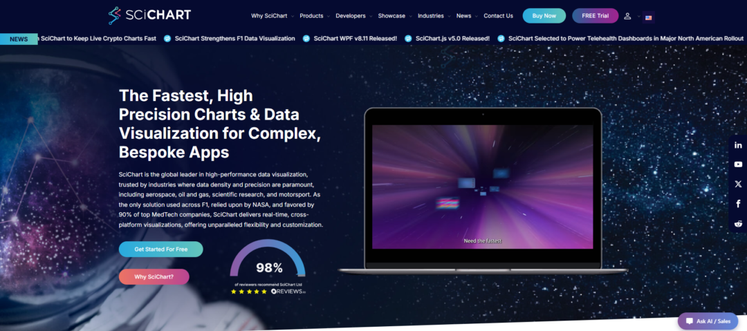
SciChart, widely regarded as the best JavaScript chart library for high-performance applications, launched in 2012 with its proprietary Vx™ GPU-accelerated engine. It specializes in scientific, financial, and industrial software where massive datasets and real-time rendering push conventional charting tools beyond their limits.
It can render hundreds of millions of data points at 60 FPS with no dropped frames — performance that most libraries simply can’t match. Real-time oscilloscopes, high-frequency trading screens, and seismic visualizations all run smoothly.
Beyond speed, it packs 2D, 3D, geo-maps, gauges, polar charts, and heatmaps into one library. It supports JavaScript/React, WPF, iOS, Android, and macOS, so teams can share rendering logic across web and native apps. It’s not open-source, and you’ll need to contact them for pricing, but when you need a millisecond response with massive datasets, SciChart really stands out.
Pros:
- Renders hundreds of millions of datapoints
- Supports 2D/3D charts, heatmaps, gauges, and geo maps
- Highly customizable API
- Nearly 500 five-star reviews
- Strong documentation with 170+ demos and an AI assistant
Cons:
- Lower brand visibility than larger competitors
- Commercial license required for production use
- Competes in a market dominated by open-source tools
D3 by Observable
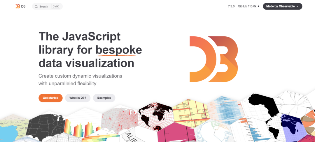
D3.js launched in 2011 as a fully open-source library. It provides low-level tools for connecting data to the DOM, SVG, or Canvas. You stay in full control and can create highly custom visualizations that go beyond what most libraries offer.
It’s been used for years by teams at The New York Times, Bloomberg, and many other data-heavy applications where off-the-shelf charts aren’t enough.
Expect a real learning curve. You’re coding scales, animations, and geographic features yourself rather than using a drag-and-drop builder. Still, that flexibility is the whole idea. For projects that need distinctive interactivity or custom data presentations, D3 remains one of the few options that won’t limit you.
Pros:
- Complete creative control over every SVG path, Canvas pixel, and DOM node
- Zero licensing fees; thriving open-source community with 15+ years of production use
- Unmatched flexibility for custom maps, network graphs, and narrative-driven visualizations
Cons:
- Steeper learning curve than high-level charting libraries—no drag-and-drop shortcuts
- Requires manual integration with React/Vue/Angular; not a drop-in component library
Highcharts
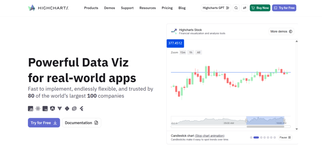
Highcharts comes with a full set of modules — Core, Stock, Maps, Gantt, Grid, and Dashboards. This makes it easy for teams to pick and combine what they need for their specific application.
It’s designed with real-world production in mind. Accessibility features like keyboard navigation and screen reader support are built in, and the charts respond well on mobile, tablet, or desktop.
The React support is straightforward, and the unified API covers everything from financial time-series and heatmaps to project timelines. Most teams appreciate that it already solves many common problems that would otherwise take extra development time.
Pros:
- Modular licensing for charts, maps, and Gantt visualizations
- Strong accessibility support with WCAG-compliant features
- Official React, Angular, and Vue integrations
Cons:
- Commercial licensing requires contacting sales—no public pricing tiers
- Steeper learning curve than Chart.js for developers wanting quick prototypes
amCharts
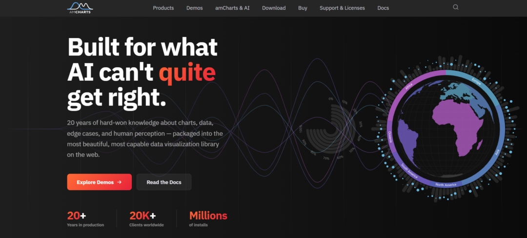
amCharts started back in 2006 and has grown into a full data visualization platform used by over 20,000 companies worldwide. While many newer tools stick to basic charts, amCharts offers more than 60 types, including interactive maps, financial charts, and Gantt timelines.
This range comes from years of real enterprise use and customer input. Its Canvas rendering handles large datasets well and meets accessibility standards that many SVG libraries struggle with.
It’s more than just charts — you get maps, timelines, and stock tools all in one place. Teams turn to it when they need solid, production-ready visualizations for financial dashboards, geographic data, or project timelines without piecing together several libraries.
Pros:
- 60+ chart types cover edge cases competitors ignore (heatmaps, chord diagrams, Sankey flows)
- Canvas rendering handles datasets that choke SVG-based alternatives
- 20-year track record means battle-tested code and comprehensive documentation
Cons:
- Commercial licensing pricing requires a quote—no published tiers
- Steeper learning curve than minimalist libraries like Chart.js
ZingChart
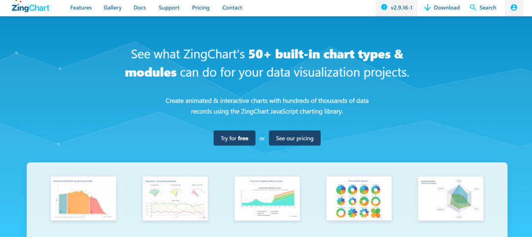
ZingChart has been around since 2009. It’s a clean, dependency-free JavaScript library designed specifically for mid-to-large datasets — think 10k to 100k records, which is the sweet spot for most business dashboards.
Over 50 chart types are available immediately, from basic to specialized, with no installation or extra configuration required. Drill-downs and live updates function out of the box, eliminating custom code and state management while scaling cleanly.
That’s why teams working on analytics portals and operational dashboards like it so much — it cuts through the usual friction and lets them ship faster.
Pros:
- 50+ chart types cover nearly every use case without plugins
- Real-time updates and drill-down built in, not bolted on
- Dependency-free architecture simplifies integration and reduces bundle size
Cons:
- Pricing model not publicly documented—requires sales contact
Fusioncharts
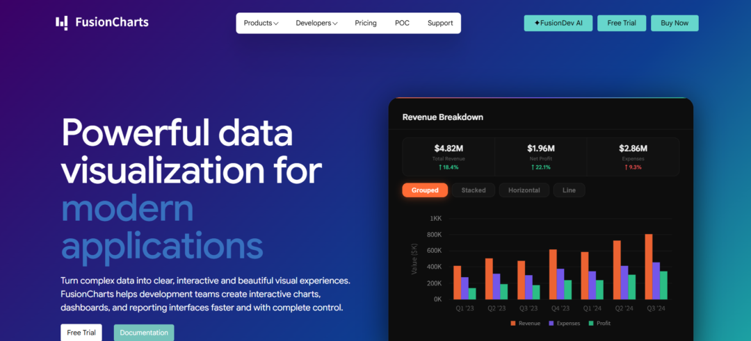
Since it launched, FusionCharts has focused on giving developers plenty of choices. You get 95+ chart types, over 1,400 maps, and 20+ dashboards, all running through the same reliable engine.
It plays nicely with pretty much every major framework — React, Angular, Vue, or just plain JavaScript. The integration feels consistent, so you’re not stuck rewriting visualization code when you move between projects or teams. Same API, same setup.
This breadth makes a real difference. Financial dashboards can pull in candlestick and Bollinger charts, logistics tools get Sankey diagrams and heat maps, and leadership reports use funnels or waterfalls. Everything stays responsive and looks good on both desktop and mobile without needing extra builds. One codebase handles it all.
Pros:
- Largest built-in chart catalog eliminates custom-build overhead for specialized visualizations
- Framework-agnostic architecture prevents vendor lock-in and simplifies team onboarding
- Geographic mapping suite rivals dedicated GIS libraries with 1400+ pre-configured maps
Cons:
- Commercial licensing with quote-based pricing—no public rate card for budget planning
Plotly
Plotly offers solid open-source charting libraries and Dash, a Python framework built for interactive data apps. With Dash, teams can turn simple charts into complete analytics dashboards without doing much front-end work.
Plotly Studio adds AI tools that pull insights directly from raw data. Plotly Cloud makes sharing and collaboration easier. For bigger setups, Dash Enterprise provides self-hosted options with SSO, job scheduling, and version control.
This mix of a reliable open-source foundation and useful commercial features works well for data teams. It’s a practical choice for both customer-facing analytics and internal platforms.
Pros:
- Open-source Plotly.js library eliminates licensing friction for core visualization needs
- Dash framework converts Python data pipelines into interactive web apps without JavaScript
- AI-native Plotly Studio generates insights and visualizations from natural language prompts
Cons:
- Dash Enterprise pricing requires a sales contact for self-hosted deployments
- Python-first architecture may not fit JavaScript-native development workflows
ApexCharts
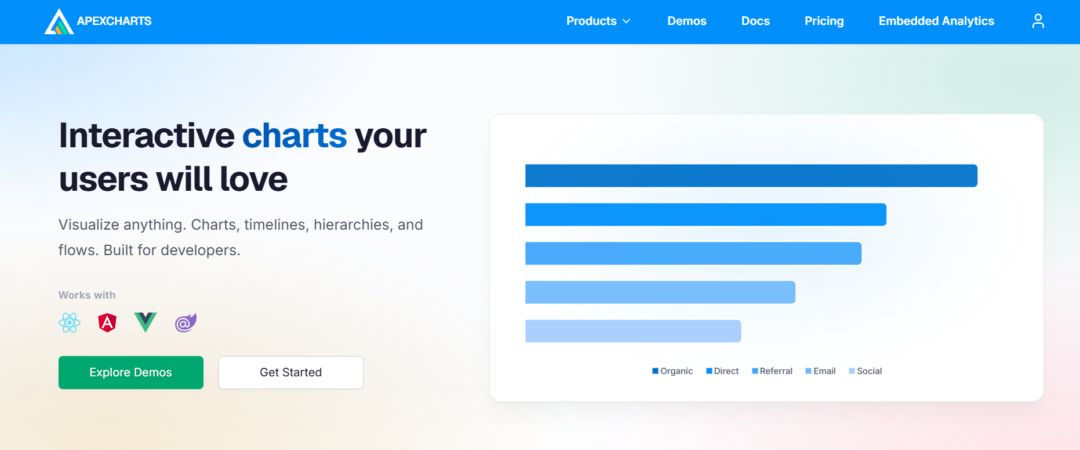
ApexCharts came out in 2018 and supports React, Angular, Vue, and Blazor right from the start. That cuts out a lot of setup headaches for teams working across multiple frameworks.
It includes over 20 chart types with handy built-in features like zooming, panning, tooltips, and annotations. Normally, these would take weeks to code yourself. The API is clean and well-documented, so even junior developers can build production-ready charts in just a few hours. Senior engineers also appreciate the flexibility for custom styling and event hooks.
Overall, it gives you smooth, interactive dashboards and SaaS apps out of the box. The charts feel responsive and work well on mobile without the usual SVG or Canvas debugging across browsers.
Pros:
- Framework wrappers eliminate integration friction for React, Angular, Vue, and Blazor stacks
- Interactive features (zoom, pan, annotations, brush selection) ship enabled by default
- Responsive design and touch support work immediately on mobile without custom code
Cons:
- Lower-level SVG/Canvas control is abstracted away—deep customization requires working within the library’s opinion
- No published benchmarks for datasets beyond 100k points; may not match GPU-accelerated alternatives at extreme scale
Apache ECharts
Apache ECharts has been around since 2012 as a fully open-source Apache Foundation project. It offers solid enterprise-grade charting without any licensing costs.
With more than 20 chart types — from basic bars and lines to Sankey diagrams, heatmaps, and graphs — it fits a wide range of needs, including regular dashboards, network views, and mapping applications. Its Canvas and SVG support handles large datasets smoothly, even in real-time or IoT scenarios.
On top of that, it’s responsive, accessible, and backed by good docs and an active community. It integrates with pretty much any stack, though expect a steeper learning curve than some simpler alternatives. For teams prioritizing open-source stability and variety over raw performance, ECharts is often a smart pick.
Pros:
- 20+ chart types with Canvas/SVG dual-mode rendering
- Progressive rendering handles massive datasets without UI freeze
- Apache Foundation governance ensures long-term stability
Cons:
- Steeper learning curve than component-based React libraries
- No GPU acceleration for extreme real-time scenarios
CanvasJS
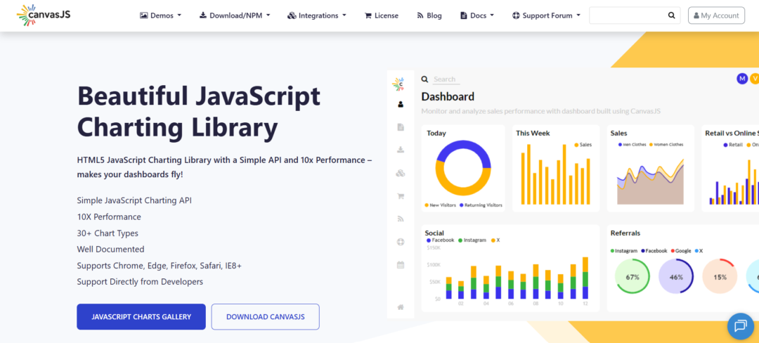
CanvasJS launched in 2013. It comes with over 30 chart types, including a dedicated StockChart for financial data. Everything is powered by HTML5 Canvas rendering, which scales nicely with big datasets and generally outperforms SVG libraries.
The API stays straightforward. Developers can add zooming, panning, and mobile-friendly interactions without diving deep into complex JavaScript. It’s accessible for teams that need strong performance without a heavy learning curve.
Canvas really shines here. Unlike D3 or Recharts, which use SVG, CanvasJS draws with pixels. This makes a big difference when handling thousands of points in real-time dashboards or IoT monitoring — everything stays buttery smooth while other tools start to lag.
Pros:
- Canvas rendering delivers measurably faster performance than SVG on datasets exceeding 10,000 points
- StockChart module includes built-in candlestick, OHLC, and range selectors for financial applications
- Straightforward API reduces implementation time compared to lower-level libraries
Cons:
- No official React, Vue, or Angular wrappers—requires manual integration
- Canvas approach trades pixel-level control for performance gains
Chart.js
Chart.js is a community-driven open-source library where contributions are welcome. Many developers prefer it for its transparency and extensibility over proprietary options.
It supports eight common chart types (Line, Bar, Radar, Doughnut, Pie, Polar Area, Bubble, Scatter) via HTML5 Canvas—enough for most web dashboards. You get responsive layouts, animations, and mixed charts out of the box, plus a simple API for quick prototyping and easy customization.
It integrates smoothly with any framework, making it ideal for startups and teams focused on maintainable code.
Pros:
- Free and open-source with strong community support
- Lightweight and fast rendering for web applications
- Easy-to-use API with extensive documentation
Cons:
- 8 chart types trail amCharts (60+) and ZingChart (50+) for specialized visualizations
- Community-only support—no SLA or dedicated engineering for enterprise escalations
Conclusion
When selecting a charting library, focus on what actually fits your project instead of just following the crowd.
If you’re dealing with massive real-time data streams, you’ll probably need a GPU-accelerated solution. For typical static dashboards with moderate data, a simpler Canvas or SVG library is often plenty. Framework compatibility, accessibility, pricing, and the range of available chart types all play a role in the decision.
The truth is, no one library solves every problem. Take time to list your non-negotiable requirements — data volume, update frequency, frameworks, and team expertise. Then test the candidates with real data from your use case, not just the nice-looking vendor examples.