Outstanding design is the thing that the user could never notice, but when it is absent, your business might get into trouble. The number of websites already exceeded the 2 billion mark, and for you, it means high competition. It doesn’t matter in what industry are you in Agriculture, Manufacturing, Retail, or Healthcare. Without a shadow of a doubt, market leaders will have great online representation in any industry, so you need to keep up in order to get all of your potential profits.
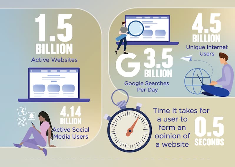
An internet user in the United States of America visits over 130 websites per day on average and spends less than 50 milliseconds to form an opinion. How to make sure that it will be your pages and their opinion will be good? While the visits are in the hands of your marketing and SEO experts, you can make a great impression on users by boosting your design efforts.
Website navigation design is a part of the website redesign strategy, and navigation is all about the journey of the user through your pages. We will share our experience and expertise to offer you a wide perspective on this subject.
“Design creates culture. Culture shapes values. Values determine the future.”
— Robert L. Peters
Essential types of navigation
So, navigation means the way your users will locate the necessary information via the navigation menus. It may include the following types:
- meta navigation (everything placed on the top part of your page)
- primary navigation (elements located below meta navigation)
- secondary and tertiary navigation (elements like drop-down menus, horizontal listing, or sidebar)
- footer navigation (everything placed at the very bottom of a page)
In most cases, you will use almost all types of website navigation, in one way or another, to achieve your results.
The importance of having fine-tuned website navigation structures
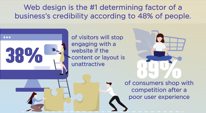
The benefits of a great design are many, and, most importantly, the design adds to the credibility of your entire business. There are multiple key elements to an outstanding website navigation design, and they include
- overall consistency
- clear and defined hierarchy between all website navigation bars
- mental model of the users
- simplicity of comprehension
- common elements and patterns of the user interface
- experience without friction
The most popular website navigation menu types
While we will discuss multiple elements of navigation structure of a website below, keep in mind that in a real-world product it is always a combination of different elements that make it all work.
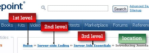
Breadcrumbs
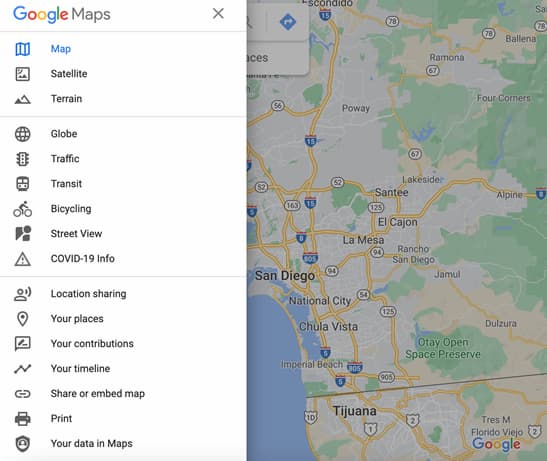
This is considered to be a secondary navigation system that shows a location of a user. Breadcrumbs are the favorite choice for e-commerce websites because they allow deep hierarchical subcategorization. Here is an example:
The Hamburger menu
While being more popular on mobile apps, the hamburger menu is still among the most popular website navigation bar designs among available options. This menu looks like three bars that resemble a hamburger. When you click or tap on them, other options for destinations pop up and users can move to other places. The primary purpose of their usage is to save space, however, multiple studies showed that they are not as effective as they are perceived to be, due to their lack of discoverability. Here is how the hamburger menu might look:
Tabs
This type also has more implementation cases in the mobile realm. This navigation type is built to save vertical space. The information is displayed across tabs here, and the tabs are usually on the top or the bottom of the screen. Here is an example:
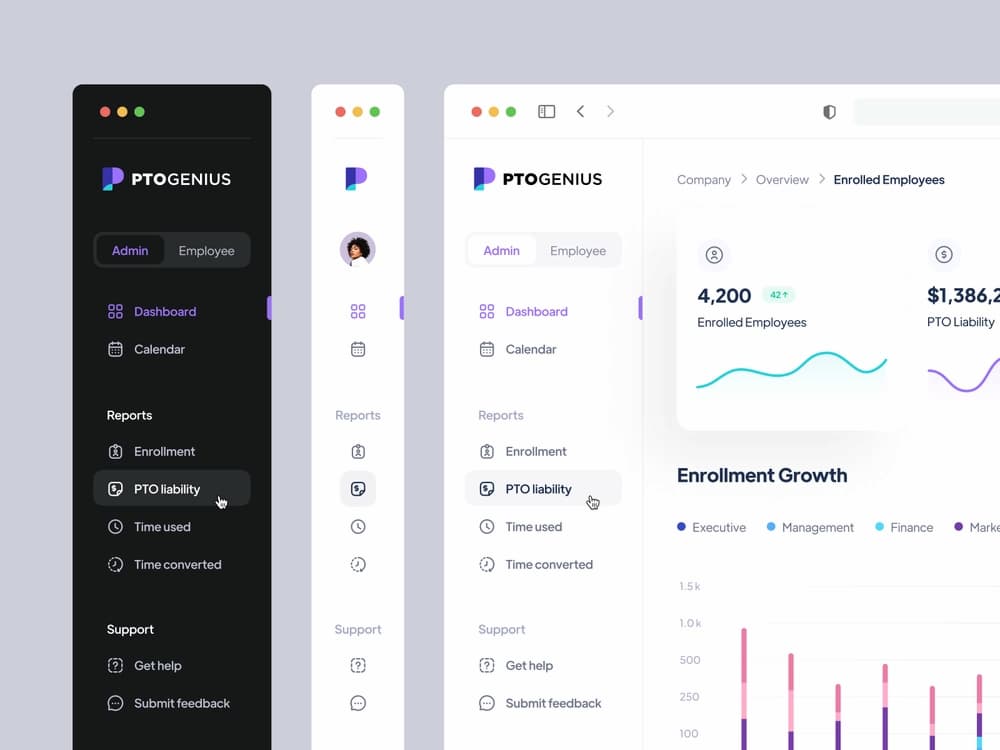
Vertical navigation
Typically placed on the left side, vertical menus take a big part of a screen and include links with multiple levels of website navigation. It is a great way to add up an enormous amount of options using a reasonable amount of space. Here is an example of vertical navigation:
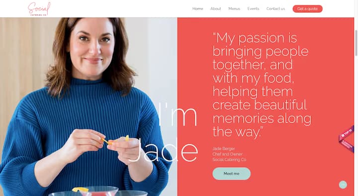
CTA buttons
Finally, we should mention one of the website menu types that can make all the difference in your business results. An accurately placed CTA (Call-to-action) button can drive your revenues by getting more customers. Here is an example of the design:
Website navigation best practices in 2022
| Best practices for navigation design | |
| Keep everything clear | Ensure that all labels are appropriate for their respective locations |
| Make your labels descriptive | Place as much information as you can in your labels to get UX and SEO benefits |
| Align navigation design with user goals | Keep in mind the interests of your focus groups while designing your pages |
| Don’t ignore navigation cues | This element could be very important to add up to the user experience |
| Have prototyping and testing phases | Make sure that you decided on the best navigation design and everything works just as planned |
| Ensure mobile responsiveness | Your website must work perfectly on screens of any size for you to get maximum revenues |
| Check all key navigation elements | Avoid common mistakes while placing your key navigation elements |
With types of menus on websites out of our way, we can focus on some tips and best practices that will allow you to get more bang for your buck. What can make your top navigation bars, footers, or any other design elements more effective compared to your competition? These insights will help you figure it out!
Keep everything clear
You should make everything understandable and clear, and don’t make the user waste any second trying to understand what you meant in a particular part of the website. All labels must suit the directions that they are leading. If you make the experience confusing for the users, you will end up losing potential clients.
Another important issue that should be addressed is keeping consistency across the entire design of your website. It will add up to the ease of comprehension for the visitors during their journey.
You can leverage your creativity and invent something that hasn’t been done before, and try to stand out with your idea. However, in the website navigation design area it is an exception to the rule, and more often than not, keeping navigation simple will be key to your success.
Make your labels descriptive
Top-level navigation categories are a great place to inform your users what your website is all about and leverage SEO as well. If your business provides some kind of service, make sure to describe what those services are, mentioning as much detail as makes sense. The more informative your categories will be, the more intuitive experience your users will get.
Align navigation design with user goals
First, you need to come up with the target groups with your marketing department. What are the focus groups of users that you are aiming for? What are the goals for them to visit your pages, and what value they can get? After figuring out what your target users might be interested in, try to design your navigation according to these suggestions. Your target users must be able to locate necessary pages in the shortest amount of time, see that your business is trustworthy, and be able to contact support services when needed.
You can come up with different navigation scenarios for different focus groups and select the middle ground between them in your final navigation structure.
Don’t ignore navigation cues
The navigation cues are helping users to understand where are they located at the moment. This element is also very helpful in creating a consistent navigation design that will become a delightful experience for your users.
Have prototyping and testing phases
If you don’t skip a prototyping phase, you will be able to see which navigation designs work better than the others and will be able to make all necessary adjustments before the release of the final product. As for testing, having this phase in your process will help you save money in the long run. Such testing tools as Optimal Flow and HotJar will be very helpful in achieving flawless functionality.
Ensure mobile responsiveness
Today, if your website doesn’t work properly on mobile devices, you are at risk of losing your business altogether. With a custom software development partner, you can cover this area before the development process even starts. However, if you choose a website builder instead of hiring a team of professionals, make sure that the platform supports mobile functionality as much as possible.
Check all key navigation elements
The final tip for today will be to check that all navigation elements are in place. The most common mistakes include:
- Not make hyperlinks obvious and don’t highlight them with a color that will stand out
- Not striking a balance of adding elements to your header
- Not keeping sidebars separate
- Forgetting about footer links, and failing to get the most out of your navigation design
FAQ
What is navigation in website design?
This is the journey that users take while visiting your website. A good user experience in this area is achieved by the proper placement of multiple elements of your pages and ensuring the logical transitions between them. More often than not, the users won’t even notice the well-crafted design of the journey. However, when it is messed up, it could be a big challenge for your business in getting revenue from your website.
How to plan website navigation?
It combines multiple elements and has different approaches to do it right. Every case is unique, so there is a one-size-fits-all recipe. It will be a good idea to contact a software development company with proven experience to help you, at least with consultation services if you have the necessary design and tech skills.